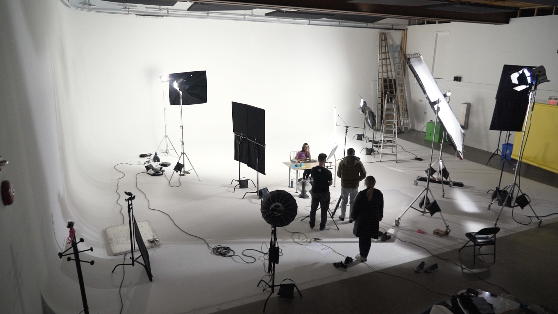
Lighting is one of the most important aspects to creating a high quality image. 3 point lighting is a classic approach to generate a cinematic look and is a setup that can be replicated in many different ways and on any budget. We’re going to break down two examples of 3 point lighting setups in different spaces and on different budgets; $10k and $50k.
3 point lighting is exactly as it sounds, using three primary points of lighting to bring life and shape to the subject of photography.
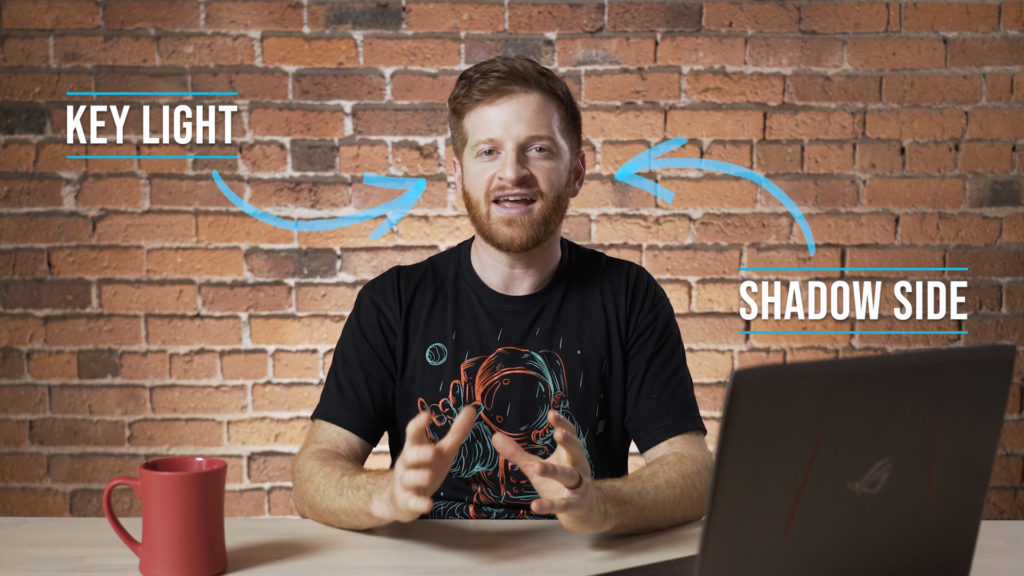
KEY LIGHT: This is the primary source of light that is illuminating the subject. This light is often placed about 45 degrees to the side of the subject and at a 45 degree angle above the subject.
FILL LIGHT: The fill light is placed on the opposite side of the subject to the key light. Its purpose is to fill in some of the shadow created by the key light. Often, this is not a light at all, but could be a bounce to create the fill or even flops for negative fill (which I will explain in more depth later).
BACKLIGHT/HAIRLIGHT: The backlight is placed behind the subject and is used to create a rim, or outline, of light around the subject’s head and shoulders. This helps to separate the subject from the background, giving the image more depth.
It is important to consider that a 3point set up does not always just contain 3 lights in the typical configuration. It is very common to have more or even less lights, while still following the framework of a 3point setup. The 3 point design indicates the 3 primary types of light sources illuminating the subject. In many scenarios you will see more than 3 lights placed for a scene or shot, but very often is possible to break it down and identify the 3 points of light listed above.
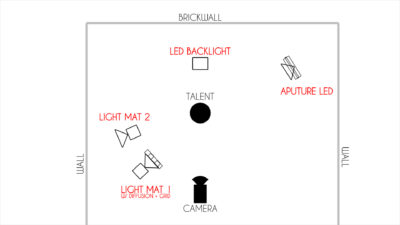
This is an overhead example of 3 point lighting in a small room. You may be thinking that this doesn’t look like the typical 3-point set up that I have been descibing, but this still follows the same framework mentioned above. The 2 lightmats on the left side of the diagram are acting as our keylight. Lightmat 1 is pointing directly at our talent to create a clear and definitive source of light from camera left. Lightmat 2 is bouncing off the white wall in the room. This is working to lift the overall light in the whole room, while maintaining the shadow and depth created by the angle of lightmat 1. Lightmat 2 is essentially working to supplement the effect of Lightmat 1, without competing with it. If they were both pointed directly at the talent then we would run into the issue of double shadows, but by bouncing the light we are able to create a soft enough source to avoid that.
There is actually no physical fill light in this setup, which doesn’t mean it is not still a 3 point set up. As crazy as it sounds the lack of a fill light has as much of an effect as a placed fill light would. In this case, having no fill allows the key light to falloff the subject’s face naturally. The angle of the key light illuminates enough of the face and creates enough contrast in the image to negate the need for fill. As mentioned before we could also add negative fill in this scenario to create more contrast on the face, but we will get into that more in the next example.
We also have 2 backlights in this example, which are essentially any light that is behind the subject. The aputure LED is working as a hairlight to at a rim around the head and shoulder of the subject. It is most common to place the hairlight on the opposite side to the key light, that way it is creating the separation on the shadow side of the subject. The other LED Backlight is just illuminating the background, without spilling on the subject. These two lights combined help to separate the subject from the background and give the image more depth.
Let’s take a look at the final result of this lighting setup. When comparing this to the overhead diagram it is clear to see the function of each of the lights and how they work together to build an interesting and dimensional image.
This setup was created (including camera, lighting, other gear, and locations) for a budget of approximately $10,000, but it could be replicated with almost budget and gear. We’re now going to move onto another 3point set up that was done on a $50,000 budget in a bigger studio setting. As you can see from the picture below on the left, this setup required a lot more space and equipment. It’s also important to note that we had a much bigger crew for this setup than we did for example one. We want to demonstrate that getting quality lighting is possible on any scale and budget, as long as you understand the core concepts of how light behaves and what looks good.
Soft lighting is much more flattering on human skin than hard light, which is why in both of these examples the key light is very soft and diffused. The picture on the right showcases how we diffused the key light in this situation. We have a large diffusion frame that spreads the beam of light, making the quality of light softer. The black grid on the front of the frame helps to re-focus the direction of the light, so that it is not spilling too much around the whole room.

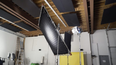
In this example we have negative fill on the shadow side of the key light. In the picture above on the left we can see 2 4×4 flops places on camera left of the subject. These are what is creating that negative fill, and increasing the amount of contrast on the subjects face. Without the flops next to the subject the key light, and other lights in the studio, would be bouncing off the white walls and floor which would create fill on the shadow side of the subject. While this is definitely still happening to some extent, the flops prevent some of that light from bouncing back. With a bigger negative fill we could reduce more light bounce and create even more of a contrasting image, and vice versa for a small or no negative fill. Negative fill is a great tool to understand and utilize, because it allows more control over the final image and lets you shape the lights around you to be more refined.
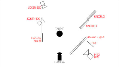
Let’s move on to look at the overhead diagram for this studio set up. We can see the key light (M12 HMI) with the diffusion grid, and the flops for negative fill to the right and left of camera respectively. So let’s talk about the other lights in play for this setup. First we have the Joker800 which is acting as a typical hairlight. It is placed at the back of the space just outside of frame on camera left (the opposite side to the key light) and is pointing directly at the subject. Just like the hairlight in example 1, it is working to help add some definition to the subject and separate them form the background.
In example 1 you should remember that we had a single backlight that was illuminating the wall without effecting the levels of light falling on the subject himself. In this studio example we are practically doing the same thing, however we have more lights working to create a more evenly lit backdrop. Because we were working in a studio a white infinity wall, we wanted to maintain that illusion of empty space behind the subject. This meant eliminating all shadows from the background that would give the viewer an indication of the real space. We have 2 Kinoflo light banks on camera right and a Joker400 on camera left with a softbox. This created a nice smooth and even tone to the background of the image. Notice that both of these light fixtures are placed behind the talent, and are as close to the edge of frame as possible. This prevents the lights from spilling as much and effecting the overall light falling on the subject. Light spillage can also be controlled by flops or flags, as seen on the right side of the keylight (M12 HMI).
This studio setup, like our set up in example 1, follows the rules of 3 point lighting despite having 5 light fixtures. Again we can identify the points of light that build up the scenes; the key light, the fill light, and the backlight. Both of these examples made use of multiple backlights which is a very common approach in filmmaking. The reason for this is to light the subject and their background independently of each other, allowing you to create an ideal balance between the two. Having one massive key light that illuminates both the subject and the background can work, however it gives you less control over the image and often reduces the separation between the background and the subject because they are both so evenly lit.
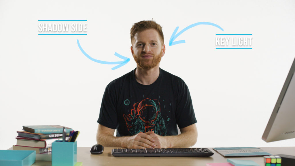
Here we can see the final result of that studio setup. When compared to example 1 we can see a lot of similarities in the overall look. We have a similar contrast between the keylight and the shadow side of the image, and the hairlight has a very similar effect on the image. Example 2 appears to have more depth, but that is only because the space behind the subject looks like it could be infinite. In example 1 we can see a very real wall behind the subject, which gives us a very accurate indication of the distance between it and the subject. Example 2, however, has no such identifier, which gives us the illusion of infinite space. The backlights play a very important role in maintaining this illusion, because any small shadow in the background would act as an indicator of depth.
Check out a
video that we made comparing the budgets and setups of these two examples, and feel free to ask questions here or on the video about the setups.
 Lighting is one of the most important aspects to creating a high quality image. 3 point lighting is a classic approach to generate a cinematic look and is a setup that can be replicated in many different ways and on any budget. We’re going to break down two examples of 3 point lighting setups in different spaces and on different budgets; $10k and $50k.
3 point lighting is exactly as it sounds, using three primary points of lighting to bring life and shape to the subject of photography.
KEY LIGHT: This is the primary source of light that is illuminating the subject. This light is often placed about 45 degrees to the side of the subject and at a 45 degree angle above the subject.
FILL LIGHT: The fill light is placed on the opposite side of the subject to the key light. Its purpose is to fill in some of the shadow created by the key light. Often, this is not a light at all, but could be a bounce to create the fill or even flops for negative fill (which I will explain in more depth later).
BACKLIGHT/HAIRLIGHT: The backlight is placed behind the subject and is used to create a rim, or outline, of light around the subject’s head and shoulders. This helps to separate the subject from the background, giving the image more depth.
It is important to consider that a 3point set up does not always just contain 3 lights in the typical configuration. It is very common to have more or even less lights, while still following the framework of a 3point setup. The 3 point design indicates the 3 primary types of light sources illuminating the subject. In many scenarios you will see more than 3 lights placed for a scene or shot, but very often is possible to break it down and identify the 3 points of light listed above.
 This is an overhead example of 3 point lighting in a small room. You may be thinking that this doesn’t look like the typical 3-point set up that I have been descibing, but this still follows the same framework mentioned above. The 2 lightmats on the left side of the diagram are acting as our keylight. Lightmat 1 is pointing directly at our talent to create a clear and definitive source of light from camera left. Lightmat 2 is bouncing off the white wall in the room. This is working to lift the overall light in the whole room, while maintaining the shadow and depth created by the angle of lightmat 1. Lightmat 2 is essentially working to supplement the effect of Lightmat 1, without competing with it. If they were both pointed directly at the talent then we would run into the issue of double shadows, but by bouncing the light we are able to create a soft enough source to avoid that.
There is actually no physical fill light in this setup, which doesn’t mean it is not still a 3 point set up. As crazy as it sounds the lack of a fill light has as much of an effect as a placed fill light would. In this case, having no fill allows the key light to falloff the subject’s face naturally. The angle of the key light illuminates enough of the face and creates enough contrast in the image to negate the need for fill. As mentioned before we could also add negative fill in this scenario to create more contrast on the face, but we will get into that more in the next example.
We also have 2 backlights in this example, which are essentially any light that is behind the subject. The aputure LED is working as a hairlight to at a rim around the head and shoulder of the subject. It is most common to place the hairlight on the opposite side to the key light, that way it is creating the separation on the shadow side of the subject. The other LED Backlight is just illuminating the background, without spilling on the subject. These two lights combined help to separate the subject from the background and give the image more depth.
Let’s take a look at the final result of this lighting setup. When comparing this to the overhead diagram it is clear to see the function of each of the lights and how they work together to build an interesting and dimensional image.
 This setup was created (including camera, lighting, other gear, and locations) for a budget of approximately $10,000, but it could be replicated with almost budget and gear. We’re now going to move onto another 3point set up that was done on a $50,000 budget in a bigger studio setting. As you can see from the picture below on the left, this setup required a lot more space and equipment. It’s also important to note that we had a much bigger crew for this setup than we did for example one. We want to demonstrate that getting quality lighting is possible on any scale and budget, as long as you understand the core concepts of how light behaves and what looks good.
Soft lighting is much more flattering on human skin than hard light, which is why in both of these examples the key light is very soft and diffused. The picture on the right showcases how we diffused the key light in this situation. We have a large diffusion frame that spreads the beam of light, making the quality of light softer. The black grid on the front of the frame helps to re-focus the direction of the light, so that it is not spilling too much around the whole room.

 In this example we have negative fill on the shadow side of the key light. In the picture above on the left we can see 2 4×4 flops places on camera left of the subject. These are what is creating that negative fill, and increasing the amount of contrast on the subjects face. Without the flops next to the subject the key light, and other lights in the studio, would be bouncing off the white walls and floor which would create fill on the shadow side of the subject. While this is definitely still happening to some extent, the flops prevent some of that light from bouncing back. With a bigger negative fill we could reduce more light bounce and create even more of a contrasting image, and vice versa for a small or no negative fill. Negative fill is a great tool to understand and utilize, because it allows more control over the final image and lets you shape the lights around you to be more refined.
 Let’s move on to look at the overhead diagram for this studio set up. We can see the key light (M12 HMI) with the diffusion grid, and the flops for negative fill to the right and left of camera respectively. So let’s talk about the other lights in play for this setup. First we have the Joker800 which is acting as a typical hairlight. It is placed at the back of the space just outside of frame on camera left (the opposite side to the key light) and is pointing directly at the subject. Just like the hairlight in example 1, it is working to help add some definition to the subject and separate them form the background.
In example 1 you should remember that we had a single backlight that was illuminating the wall without effecting the levels of light falling on the subject himself. In this studio example we are practically doing the same thing, however we have more lights working to create a more evenly lit backdrop. Because we were working in a studio a white infinity wall, we wanted to maintain that illusion of empty space behind the subject. This meant eliminating all shadows from the background that would give the viewer an indication of the real space. We have 2 Kinoflo light banks on camera right and a Joker400 on camera left with a softbox. This created a nice smooth and even tone to the background of the image. Notice that both of these light fixtures are placed behind the talent, and are as close to the edge of frame as possible. This prevents the lights from spilling as much and effecting the overall light falling on the subject. Light spillage can also be controlled by flops or flags, as seen on the right side of the keylight (M12 HMI).
This studio setup, like our set up in example 1, follows the rules of 3 point lighting despite having 5 light fixtures. Again we can identify the points of light that build up the scenes; the key light, the fill light, and the backlight. Both of these examples made use of multiple backlights which is a very common approach in filmmaking. The reason for this is to light the subject and their background independently of each other, allowing you to create an ideal balance between the two. Having one massive key light that illuminates both the subject and the background can work, however it gives you less control over the image and often reduces the separation between the background and the subject because they are both so evenly lit.
 Here we can see the final result of that studio setup. When compared to example 1 we can see a lot of similarities in the overall look. We have a similar contrast between the keylight and the shadow side of the image, and the hairlight has a very similar effect on the image. Example 2 appears to have more depth, but that is only because the space behind the subject looks like it could be infinite. In example 1 we can see a very real wall behind the subject, which gives us a very accurate indication of the distance between it and the subject. Example 2, however, has no such identifier, which gives us the illusion of infinite space. The backlights play a very important role in maintaining this illusion, because any small shadow in the background would act as an indicator of depth.
Check out a video that we made comparing the budgets and setups of these two examples, and feel free to ask questions here or on the video about the setups.